Kalispel Natural Resources Department (KNRD)
The goal for the KNRD was to provide them with a cohesive Branding Guide that you can find here. The process included providing them with patterns for their website, color palette, type palette, and dos and don'ts of their logo.
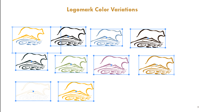
They were also provided with a revamped logo lockup, with subtle differences that gave better hierarchy and readability.
 1.png)


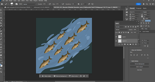
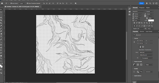
Illustrative pattern work
The river fish and cedar illustration work were early ideas for pattern work. I found that the fish pattern would not lap well, but the cedar illustration made it to the final product.
Style Tiles
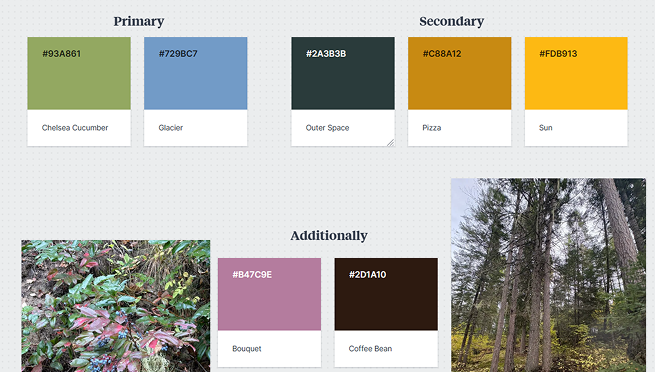
Two additional colors were added to the KNRD color palette. The goal achieved was to use real colors found around their nature reserve.
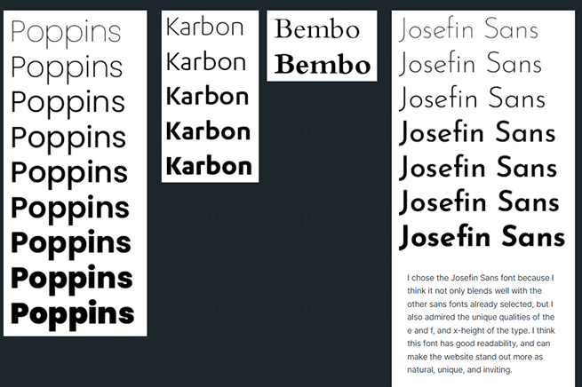
Wanted to find good readable fonts that would blend well with the logo and photos found on the website.